

Each autumn brings a new set of web design trend lists. Most rank styles by how new they look. Many come from companies that sell the tools to build them. What they rarely say is which trend will bring your business more leads.
That question matters more in 2027. Your site now has two kinds of readers: people and AI tools. In July 2025, OpenAI’s crawlers made 1,091 visits for each visitor they sent to a site.[1] A slow or hard-to-read page loses both.
I ranked six trends by what they do for a business site. The tests are speed, how easily search engines and AI can read the site, and how many people can use it. We tried the first two on our own site. For each trend, you get what to do first, then the dated evidence.
What are the web design trends for 2027?
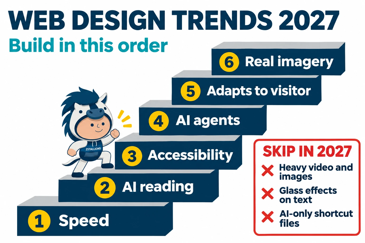
The trends that help a business site in 2027 are speed, a structure that AI can read, and access for everyone. Looks come second. Three popular trends are worth skipping.
That can sound like a list of basics. Our own site shows why they come first. On WordPress, none of our 12 key pages loaded its main content within 2.5 seconds on mobile. No new style could help until we fixed that. After our rebuild, the average fell from 10.8 seconds to 2.5 seconds.
This list is for business owners and marketing leads who plan a new site or a redesign in the next year.
Trends at a glance
Each trend is scored against the three tests. The three skips at the bottom are trends I advise against for most business sites.
| Trend | Helps speed | Helps search and AI reading | Helps access |
|---|---|---|---|
| 1. Speed-first, light builds | ✓ | ✓ | ✓ |
| 2. Sites built for AI to read | ✕ | ✓ | ✓ |
| 3. Accessible by default | ✕ | ✓ | ✓ |
| 4. Ready for AI agents that act | ✕ | ✓ | ✓ |
| 5. Sites that adapt to the visitor | ✕ | ✕ | ✓ |
| 6. Human, real imagery | ✕ | ✕ | ✕ |
| Skip: video- and image-heavy pages | ✕ | ✕ | ✕ |
| Skip: glass effects on text | ✕ | ✕ | ✕ |
| Skip: AI-only shortcut files | ✕ | ✕ | ✕ |
Helps No effect Hurts
How we ranked these trends
Each trend had to pass one rule: it must help the site win leads or be seen in AI answers.
The three tests
We read that rule as three tests, in this order:
- Does it make the site faster?
- Does it make the page easier for search engines and AI tools to read?
- Does it let more people use the site?
Where two trends pass the same tests, the one backed by our own work ranks higher. Next comes the one that is more ready today. A trend that passes none of the tests is mostly a style choice. The style section covers those.
Where the evidence comes from
The list starts from the pages that rank in Google for web design trends, and the trends that AI answers list. I then checked each trend against primary sources. These include Google’s own guidance, web standards, accessibility research, and US and EU rules.
Trends 1 and 2 also rest on our own work: the move of our own site, and speed projects for clients. The leads section uses two published case studies. Trends 3 to 6 rest on published sources only.
The six web design trends for 2027
1. Speed-first, light builds
What to do
Test your top pages with Google Lighthouse, Google’s free page-speed tool. Fix what slows them down before you change the design. Often, fixes on the site you have are enough. Read our guide to improve your website’s loading speed, or see our website maintenance service.
How fast should a page be?
Google calls a page good when its main content loads within 2.5 seconds. It calls a page responsive when it reacts to a tap or click within 200 milliseconds.[2]
Does speed affect sales?
Yes, in the best-known study. Deloitte’s 2020 “Milliseconds make millions” report was commissioned by Google. It found that a 0.1 second faster mobile site went with 8.4% more retail conversions.[3] The study is old, and it covers retail only.
What changed when we rebuilt our own site?
Our main content on mobile now loads in 2.5 seconds on average, down from 10.8 seconds. We moved our site from WordPress to Astro, a framework that builds plain, fast pages. Cloudflare serves it. We did it “to be able to speed up the site”.
On 21 October 2026, we tested 12 key pages on mobile with Google Lighthouse. These are the averages.
| Mobile, average of 12 key pages | WordPress | New site |
|---|---|---|
| Lighthouse performance score (out of 100) | 47 | 94 |
| Main content load (Largest Contentful Paint) | 10.8 s | 2.5 s |
| First content shown (First Contentful Paint) | 6.5 s | 1.7 s |
| Time the page is blocked (Total Blocking Time) | 900 ms | 97 ms |
| Page weight | 1.46 MB | 0.91 MB |
| Requests per page | 129 | 50 |
On mobile, seven of the 12 pages now load their main content within 2.5 seconds. On WordPress, none did. These are lab results from one test day. Data from real visitors takes about 28 days to show a change like this. It wasn’t in yet when I wrote this.
Does it work on other sites?
Yes. We saw the same pattern on a client site, one of many where we have worked on site speed. We can’t name the client. We cut its load time from 10 seconds to 4 seconds, measured with Pingdom, a speed-testing tool. Its bounce rate fell from 60% to 20%. The bounce rate is the share of visitors who leave after one page.
2Stallions result: We rebuilt the website of a private medical university in Malaysia. In a test before launch, its load time fell from 4.47 to 2.65 seconds, and its speed grade rose from 67 to 94. These are test results, not data from live visitors. Read the case study.
Who should act on this?
Almost every business site. A full rebuild takes time and budget, so start with fixes on the site you have.

2. Sites built for AI to read
What to do
Put the main answer of each page near the top, as real text in the page code (HTML). Use clear headings that match the questions buyers ask. Don’t pay for special AI files or markup. Our search everywhere optimisation (SEO) service covers this work. To see whether AI answers cite you, follow trend 10 in our digital marketing trends guide.
What does Google say AI search needs?
Google says AI search needs nothing special. “There are no additional requirements to appear in AI Overviews or AI Mode,” its Search Central guide says. It also says you don’t need new AI text files or special markup.[4]
The basics that help search also help AI. Put real text in the HTML. Use clear headings. Give a direct answer near the top of each section.
How much do AI tools read?
AI tools read far more than they send back. In the 12 months before Cloudflare’s August 2025 report, about 80% of AI crawling on its network was for training models. In July 2025, OpenAI’s crawlers made 1,091 visits for each visitor they referred to a site.[1] Your pages get read whether or not you see the traffic. Make them easy to read correctly.
Did it work for our site?
We don’t know yet. This was the second reason for our own move. We wanted a site that is “friendlier for AI to crawl (and hopefully cite)”. The word “hopefully” is there on purpose, because we have no result to report yet.
Who should act on this?
Service businesses whose buyers ask AI tools for advice before they call. Nobody can promise that an AI answer will cite your page.
3. Accessible by default
What to do
Build to WCAG 2.1 AA from the start. WCAG is the Web Content Accessibility Guidelines, the standard most rules point to. AA is its middle level. Run a free checker on your top pages, then fix contrast, labels, and headings first.
How common are accessibility failures?
Almost every home page still has failures that a tool can find. WebAIM’s 2026 study of the top million home pages found detected WCAG 2 failures on 95.9% of them. The average was 56.1 errors per page.[5]
Accessibility passes two of our three tests. More people can use the site. The clear structure it needs also helps search engines and AI tools read the page.
What are the legal risks in the US?
Thousands of US businesses face accessibility lawsuits each year. UsableNet counted 5,114 digital accessibility lawsuits under the Americans with Disabilities Act (ADA) in 2025. These were in federal courts and in New York and California state courts.[6]
For businesses open to the public, the US Department of Justice has no detailed web standard. Its 2022 guidance says the ADA applies to what these businesses offer on the web. It names WCAG as helpful guidance.[7]
Public bodies now have a clear standard. A Department of Justice rule sets WCAG 2.1 AA for state and local government websites. An interim rule in April 2026 moved the deadlines to 26 April 2027 and 26 April 2028.[8] The duty sits with the government body. It must also make sure that content built for it by contractors meets the standard.
Does the EU have a rule?
Yes. If you sell to people in the EU, the European Accessibility Act applies from 28 June 2025.[9] It covers a list of products and services, such as e-commerce and banking services.[10] Whether it covers your business depends on what you sell.
Who should act on this?
Every site. Public bodies and firms that sell into the EU should go first. This is not legal advice. Ask a lawyer what applies to your business.

4. Ready for AI agents that act
What to do
Make your forms clear for people now. Give every button a clear label and every field a plain name. Put the steps in a sensible order. Our landing page design service starts here. Watch how agents grow before you build anything just for them.
What can AI agents do on a website?
AI browsers have started to complete tasks for people. Google’s Chrome now has “auto browse”, which can handle “multi-step chores” on websites. In January 2026, it was in preview in the US for paying subscribers.[11]
What helps an agent use your site?
Clear buttons, plain form fields, and steps in a sensible order help an agent find and use the parts of your page. They help people too. So this trend passes the same two tests as accessibility. It ranks lower because agent use is still in preview.
Who should act on this?
Sites where a visitor books, buys, or asks for a quote. Use is still early and small.
5. Sites that adapt to the visitor
What to do
Support the visitor’s dark mode and reduced-motion settings. Both are cheap to add with standard code. Leave personalisation that needs visitor data until you have a clear privacy plan.
Which device settings can a site follow?
Dark mode and reduced motion are the two settings that matter most. Sites can follow them with standard code. One tells the site the visitor wants dark mode.[12] The other tells the site the visitor wants less motion on screen.[13]
This trend passes one of our three tests: access. Both settings help people who find bright screens or moving parts hard to use.
What is generative UI?
Generative UI is an AI model that builds “an entire user experience” for each request, screen and all. Google Research has shown it.[14] It is still research. Watch it, but don’t plan a 2027 site around it.
Who should act on this?
Sites with long reading sessions, such as guides and portals. Personalisation beyond device settings needs data about the visitor, and that needs care with privacy.
6. Human, real imagery
What to do
Replace stock and AI images on your key pages with photos of your own team and work. Our creative services team can help. Compress every photo before you upload it, or this trend runs into the first skip below.
Why do real photos stand out now?
As AI images spread, real photos of real people and real work stand out more. Merriam-Webster chose “slop” as its 2025 Word of the Year. It defined it as “digital content of low quality that is produced usually in quantity by means of artificial intelligence”.[15]
Why is it last on the list?
This trend passes none of the three tests. It is on the list because a service business sells trust. A photo of your own team or project shows buyers who they will work with.
Who should act on this?
Service firms, where trust decides the sale. Real photos are heavy files, so compress them.
Visual trends: worth it or not?
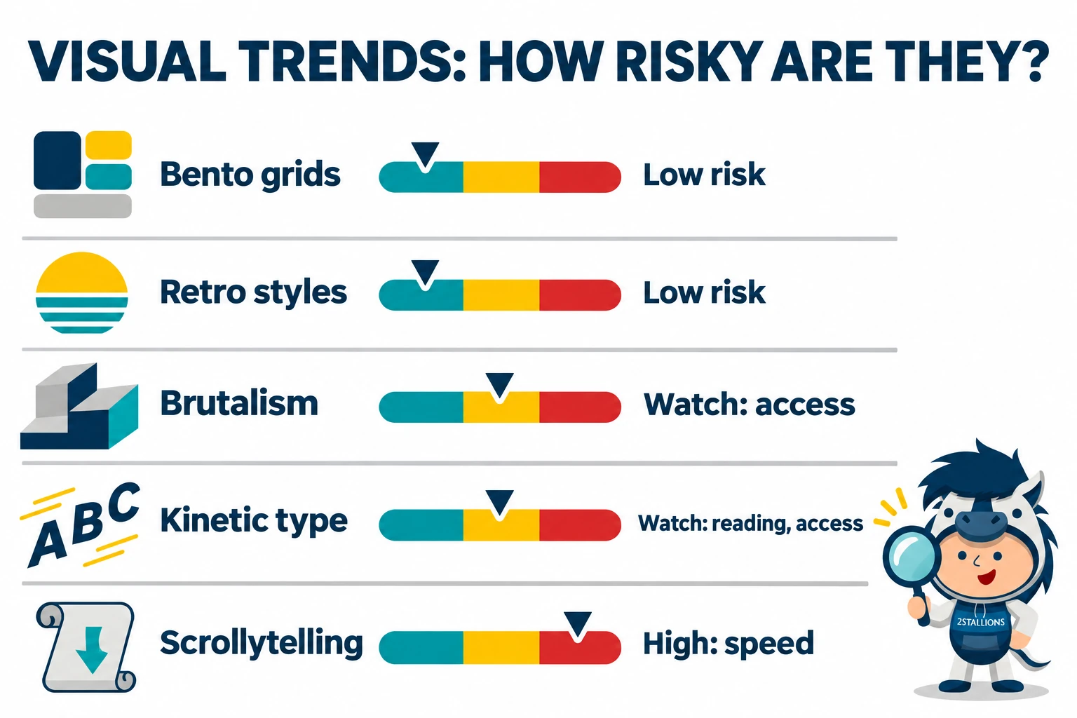
AI answers about web design trends list these styles most often. None of them passes any of our three tests by itself. Each can fail a test if it is built heavy or hard to read. Build it light, and add it after the basics.
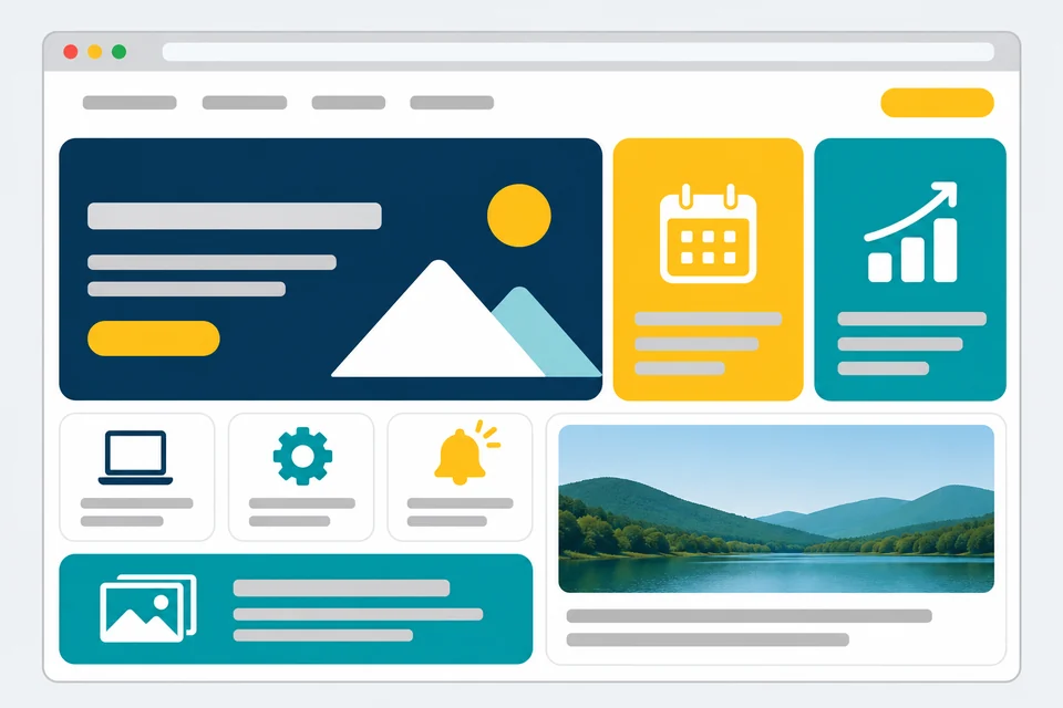
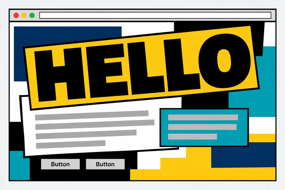
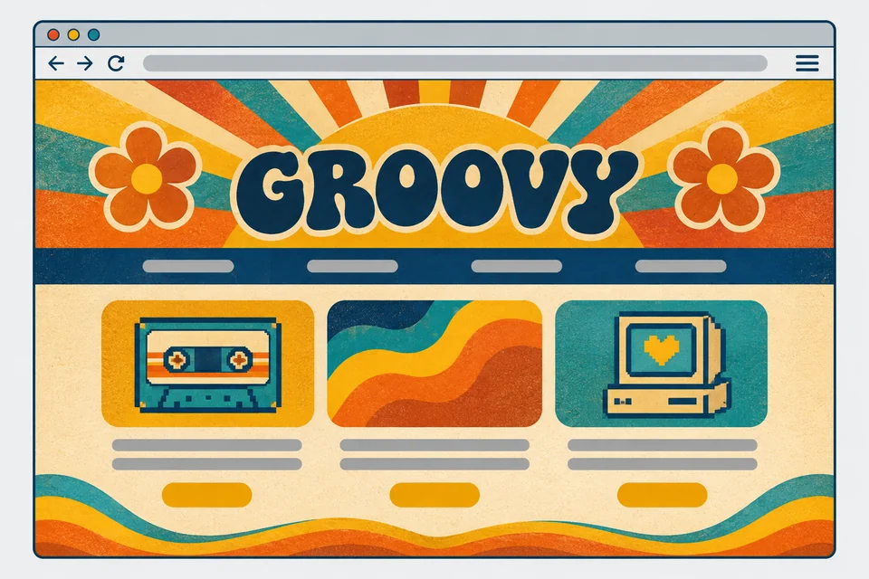
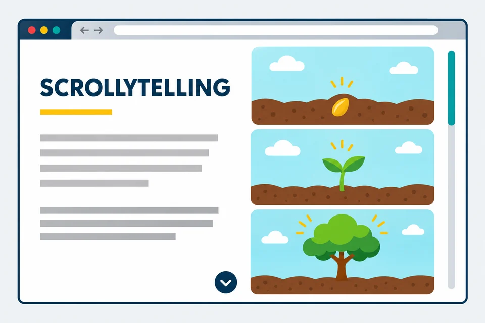
These samples show what each style looks like on a business homepage.
Bento grids
Layouts made of boxes of different sizes. Low risk, if built in plain HTML and CSS with real headings in each box.
Brutalism and anti-grid
Raw blocks and clashing type that break the usual rules on purpose. It can fail the access test, so check contrast and reading order first.

Kinetic typography
Text that moves, often built with motion graphics. Keep the words as real text, and respect the reduced-motion setting from trend 5.
Retro and nostalgic styles
Looks borrowed from older eras. Low risk, if the images behind them are compressed.
Scrollytelling
A story that unfolds as the visitor scrolls. It’s the style most likely to fail the speed test, because it often needs a lot of script.
Scrollytelling needs the most care. Long script tasks can delay how fast the page reacts to a tap or click.[16] Keep the content itself in the HTML, so the story still reads without the effects.
Glass effects are on the skip list, because they make text harder to read.
Trends to skip in 2027
Skip pages built around heavy video and images, glass effects on text, and AI-only shortcut files.
Video- and image-heavy pages
This is the trend we warn clients about most. In our experience, sites that rely too much on video or large images lose speed and search visibility. Pages are already heavy. The median mobile home page in 2025 weighed about 2.6 MB. The median for images alone was 911 KB.[17] One short, compressed video that shows your product is still worth it.
Glass effects on text
Glass and see-through effects on text look modern, but they make text harder to read. Apple brought its “Liquid Glass” look to iOS 26. The Nielsen Norman Group found clear readability problems.[18] A glass effect used only as decoration, with no text on it, is fine.
AI-only shortcut files
AI-only shortcut files, such as llms.txt, are text files meant only for AI tools. Some sellers present them as a way into AI answers. Google says you don’t need new AI text files to appear in its AI features.[4] A file like this does little harm. Don’t treat it as a strategy, or spend budget on it before the basics are done.
From a faster site to better leads
Speed brings visitors in. Lead generation turns them into enquiries. Forms that filter, spam protection, and lead tracking decide how many of them become good leads. We use all three on our own site.
Stop spam at the form
Our forms use Cloudflare’s Turnstile check to stop spam. Spam enquiries have “dropped considerably” since we started.
Track which pages bring good leads
We track each lead in our customer relationship management (CRM) system. It shows which pages and sources bring leads that turn into work, not only which bring the most.
2Stallions result: A Singapore electricity retailer needed to know where its business leads came from. We tracked every form lead back to its source and built one focused landing page for its ads. In six months, leads from ads rose 50% and leads from SEO rose 30%. Phone calls were not tracked. Read the case study.
Give each page one next step
Give each page one clear next step, so a visitor who is ready knows what to do. A form with more questions can bring in fewer, better enquiries. Our post on how UX affects bounce rate goes further on this.
2Stallions result: For a global energy drink brand, we built a campaign microsite with one job: take entries for an in-store giveaway. Over six months, 33.4% of the people who landed on it took part. Read the case study.
Who should not follow this list
Very visual consumer brands may win more from imagery and video on social media than from a plainer site. For them, this list may be the wrong fit. Even then, keep the website fast. Visitors who click through from social media land on it.
How to act on these trends in 2027
- Measure speed first. Test your top pages with Lighthouse and fix the slowest ones (trend 1). Our website maintenance team can do this for you.
- Rewrite your top pages for reading. Put the answer near the top, in real text, under clear headings (trend 2). See our content marketing service.
- Check accessibility. Run a checker and fix contrast, labels, and headings (trend 3).
- Clean up your forms. Clear labels and sensible steps help people now and agents later (trend 4).
- Add style last. Pick from the visual trends only after the basics pass.
If you want a faster site, talk to us about website development. For the wider picture, see our digital marketing trends for 2027 and our view of AI in marketing.
More 2027 trend reports
This guide is part of our 2027 trends series. Start with the digital marketing trends for 2027, or pick another guide below.
Content trends

Branding trends

Social media trends
SEO trends
Influencer marketing trends

Digital advertising trends
Google Ads trends
Frequently asked questions
Are 2026 web design trends still relevant?
Mostly, yes. Speed, accessibility, and clean structure carry over from year to year. Visual styles change faster. Check them against the three tests above before you copy one.
How often should a business redesign its website?
There is no set number of years. Redesign when the site is slow, hard to read, or no longer matches the business. Small fixes in between often do more than a full rebuild.
What are the top five web design trends for 2027?
Speed-first builds, sites built for AI to read, accessibility by default, readiness for AI agents, and sites that adapt to the visitor. Real, human imagery is the sixth on our list.
Which web design styles are trending now?
Bento grids, brutalism, kinetic typography, retro styles, and scrollytelling come up most often. None of them helps a site win leads by itself. Build them light, and add them after the basics. The samples above show each one.
What is machine experience (MX) design?
Machine experience design means building a page so that AI tools and search crawlers can read it as easily as people can. In practice, it’s trend 2: real text, clear headings, and a direct answer near the top of each section.
What counts as web design?
Web design covers how a website looks and works for the visitor: layout, colour, type, images, navigation, and forms. Website development is the build behind it. A good result needs both, which is why our website development team handles them together.
Sources
All sources were retrieved between 6 and 8 November 2026.
- Cloudflare: The crawl-to-click gap
- web.dev: Web Vitals
- Deloitte: Milliseconds make millions (2020)
- Google Search Central: AI features and your website
- WebAIM: The WebAIM Million
- UsableNet: 2025 year-end digital accessibility lawsuit report
- ADA.gov: Guidance on web accessibility and the ADA
- ADA.gov: Fact sheet on the state and local government web rule
- AccessibleEU: The EAA comes into effect in June 2025
- European Commission: European Accessibility Act
- Google: Gemini in Chrome auto browse
- MDN Web Docs: prefers-color-scheme
- MDN Web Docs: prefers-reduced-motion
- Google Research: Generative UI
- The Associated Press, via Hawaii News Now: Merriam-Webster’s 2025 word of the year is slop
- web.dev: Interaction to Next Paint (INP)
- HTTP Archive Web Almanac 2025: Page weight
- Nielsen Norman Group: Liquid Glass