Content
SHARE
In a world increasingly dominated by visual content, web design has become a delicate balance between aesthetics and fundamental principles. Crafting a visually compelling website that captivates and guides users seamlessly through its content is an art form. This art is driven by the principles of visual hierarchy—a set of rules and techniques that determine how elements are organised and presented on a web page. In this comprehensive exploration, we will delve deep into the intricacies of visual hierarchy, unravelling its importance and providing you with the knowledge and tools to master this essential aspect of web design.
Whether you're a seasoned web designer looking to refine your skills or a newcomer eager to understand the secrets behind captivating web layouts, this guide will equip you with the insights and techniques to create websites that stun their beauty and function impeccably. Join us as we uncover the secrets to creating web designs that balance aesthetics and usability perfectly, ultimately elevating your craft to new heights.
Why Visual Principles Are Vital in Web Design
Website owners try to remain at the top by producing quality content, developing cutting-edge marketing strategies, and dishing out stunning websites. Content may still be king, but no one wants to read anything on a poorly designed website. If you want your website to draw traffic, you need to think about the flow of information on your site. This means thinking about your site's layout, graphics, and structure. It's your job to ensure your readers can understand the information.
Smart and efficient web design is more relevant now that the universal display or resolution no longer exists. Mobile phones and computers now come in many screen sizes, making it essential to optimise your website to look good and function well on any device, i.e. to be responsive. For example, research shows that half of online shoppers expect a website to load in less than 3 seconds. 19% will close a website if it takes longer than 2-3 seconds to load, and 8% will leave after 1 second.
What Is Visual Hierarchy?
"Designers can create normalcy out of chaos; they can clearly communicate ideas through the organizing and manipulating of words and pictures."
—Jeffery Veen, The Art and Science of Web Design
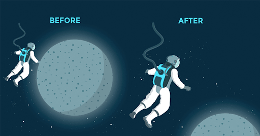
Visual hierarchy, one of the most important principles behind good web design, differentiates between a site that strategically influences user flow and decisions and a site that "looks nice." It refers to the order in which the human eye perceives what it sees. A visual hierarchy describes which elements capture your user's attention and draw their eyes most. There's no right way to build a concrete hierarchy, and competitive designers must have perfectly unique methods – or invent new ones – to stay on top of the game.
Visual presentation of a web interface is essential for:
- Informing Users
- Communicating Content Relationships
- Creating Emotional Impact
The end goal of your UI design should be to answer the following questions :
- What is this? (Usefulness)
- How do I use it? (Usability)
- Why should I care? (Desirability)
Let's describe the most basic elements, the essential building blocks necessary to support simple or complex hierarchies.
[thrive_leads id='8320′]
As a website design & development agency, 2Stallions builds custom websites that engage visitors and drive results. We combine creative design with seamless functionality to elevate your online presence. Schedule a free consultation with us now.
1. Scanning Patterns: The Predictability of the Human Eye
Understanding how people read and consume information on a webpage is paramount to effective web design. One crucial aspect of this comprehension involves recognizing the human eye's predictable scanning patterns when viewing content. For cultures that read from left to right, such as English and many others, two predominant scanning patterns emerge as influential factors in designing layouts: the F-pattern and the Z-pattern.
Source: Eye-tracking Heatmaps by Nielson Norman Group
F-Pattern
Typically, the F-Pattern is prevalent amongst readers for text-heavy websites like blogs.
Readers scan in a vertical line down the left side of the text, looking for keywords or points of interest in a paragraph's initial sentences.
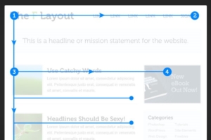
When readers find something they like, they begin reading typically, forming horizontal lines. The result is something that looks like the letters F or E. As shown, CNN and NY Times readers use the F-Pattern to read the content. Jakob Nielsen of The Nielsen Norman Group conducted a readability study based on 232 users scanning thousands of websites and elaborates on the practical implications of the F-Pattern:
- Users will rarely read every word of your text.
- The first two paragraphs are the most important and should contain your hook
- Start paragraphs, subheads, and bullet points with enticing keywords.
Z-Pattern
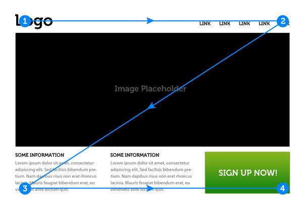
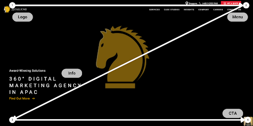
Z-Pattern scanning occurs on pages that are not focused on the text. If you were to access a Z-Pattern website, your eyes would wander horizontally over the top before sliding down at an angle. Your attention may be drawn to the menu bar or simply because you're used to reading from left to right. When you reach the end, your attention shifts down and left (again based on reading habit), and repeat a horizontal search on the lower part of the page. The Z-Pattern applies to almost any web interface since it addresses the core website requirements such as hierarchy, branding, and Calls-To-Action. The Z-Pattern is perfect for interfaces where simplicity is a priority, and the CTA is the main takeaway.
Source: Understanding The Z Layout
Forcing a Z-pattern for a website with complex content may work better than the F-pattern, but a Z-pattern can help bring a sense of order to more straightforward layouts (and increase conversion rates). Here are a few best practices to keep in mind based on the image above:
- Background: Separate the background to keep the user's sight within your framework
- Point #1: This is a prime location for your logo
- Point #2: Adding a colourful secondary CTA can help guide users along the Z-pattern
- Centre of the page: A featured image slider in the centre of the page will separate the top and bottom sections and guide the eyes along the Z path.
- Point #3: Adding icons that start here and move along the bottom axis can guide the users to the final CTA at point #4.
- Point #4: This is the finish line and an ideal place for your primary CTA.
Predicting where the user's eye will go can be a huge advantage. Before arranging the elements on your page, prioritise the most over the least important ones. Once you know what you want your users to see, placing them in the pattern's "hot spots" for the proper interactions is just a simple matter.
2. Size as a Tool for Emphasis
Bigger is more eye-catching, but it's not always better. The simplest way to explain it is that your most important element should be the one that stands out, but when we get into the details, it becomes a little more complicated. The user exerts less effort to click more oversized items. This is especially true for calls-to-action, where you want to leave no question about where the user should go.
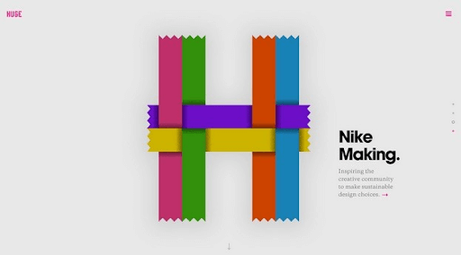
All the principles of size are visible in this screenshot from Huge Inc. The first thing you notice is the biggest, the stylistic H that serves as their logo. Next is "Nike Making," whose large typeface and bold style create immediate weight. Next is the line of text directly beneath it, written in a smaller font size to not steal attention from the key visuals. If your eyes are still interested enough to wander, they'll eventually notice the tiny logo and hamburger menu in the corners or the navigation bar to the right.
The hierarchy makes sense here. First, the large colourful H catches your eye. Soon afterwards, you'll seek context for the unorthodox visual, immediately accessible with the hyperlinked "Nike Making" headline and secondary sentence. Visual hierarchy lays out the user path, while size hierarchy simplifies interaction by making the entire chunk of copy clickable and near its related visual. Without thinking about it, you click exactly where the designer wants you to go. Balance and moderation are essential. The design should not:
- Be overpowered with an overly large focal point or
- compromise user usability with secondary content that ends up too small.
3. The Impact of Colour & Contrast
We're visually drawn to colour, especially when strategically highlighting important information or imagery. For example, a bright splash of red or yellow is hard to miss — whether it's on a traffic sign on the side of the road or a flyer hanging in your local coffee shop. Clever use of colour can be one of the most visually interesting ways to differentiate elements on a page and draw attention where you want it. Your brain's obsession with contrast will cause your eyes to focus on objects that stand out due simply to their difference in colour concerning the surrounding objects. Consider the following example:
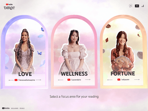
Colour plays a pivotal role in the design of the YouTube Tarot App landing page. It swiftly directs users to the three primary categories: Love, Wellness, and Fortune. The strategic use of colours further enhances this distinction. Purple is synonymous with divinity; pink, embodying the heart chakra, signifies wellness, while yellow, representing the solar plexus chakra, conveys wealth and fortune.
Hovering triggers an intuitive outline highlighting the selected option. The design seamlessly integrates the Z-pattern principle, ensuring effortless navigation. At the same time, strategically placed featured YouTubers and their respective categories are elevated as the focal point, contributing to an engaging and user-centric design.
4. Effective Layout Arrangement
One of the most straightforward ways to control your website's visual hierarchy is through its interface. Placing a focus element front and centre allows you to follow up the visual hierarchy using rows and columns for a more organised and structured layout. This can help keep the chaos at bay and leave some space for CTAs or other chosen content at the end. It can be a tedious and fiddly balance, but it is crucial to avoid overcrowding your website with too many elements. The visual hierarchy can flatten, and very little will stand out in the design.
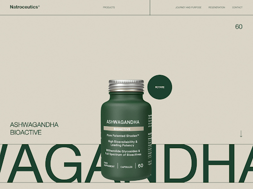
One of the most straightforward ways to control your website's visual hierarchy is through its interface. Placing a focus element front and centre allows you to follow up the visual hierarchy using rows and columns for a more organised and structured layout. This can help keep the chaos at bay and leave some space for CTAs or other chosen content at the end. It can be a tedious and fiddly balance, but it is crucial to avoid overcrowding your website with too many elements. The visual hierarchy can flatten, and very little will stand out in the design.
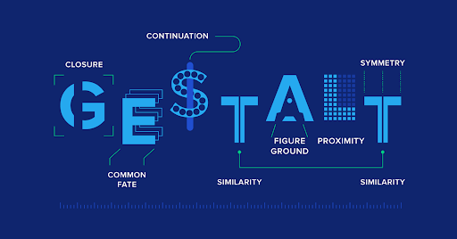
The Gestalt Principles
Gestalt principles are foundational visual perception and design concepts that explain how humans naturally perceive and organise visual elements into meaningful patterns. These principles help designers create cohesive and visually appealing compositions. The fundamental Gestalt principles include:
- Proximity: Elements close to each other are perceived as belonging. Designers can use this principle to group related content and create visual organisation.
- Similarity: Similar elements, whether in shape, size, colour, or texture, are grouped by the viewer's perception. It helps establish patterns and relationships within a design.
- Continuity: The viewer perceives continuous lines and patterns flowing more naturally than abrupt changes. Designers use this principle to guide the viewer's eye through a composition.
- Closure: When presented with incomplete shapes, the viewer's mind fills in the missing parts to perceive a whole object. Closure is used to create simplicity and encourage interpretation.
- Figure–Ground: This principle distinguishes between an object of focus (figure) and its surroundings (ground). It helps in prioritising elements and creating a visual hierarchy.
- Symmetry and Order: Symmetrical and orderly arrangements are perceived as stable and harmonious. This principle contributes to balance and visual equilibrium.
- Common Fate: Elements moving in the same direction are perceived as a group or related. Designers use this principle to imply movement or connection between elements.
- Past Experience: Familiar shapes and patterns are recognised more quickly. Designers leverage this principle to create relatable and easily understandable designs.
Applying Gestalt principles enriches design by tapping into human perception tendencies. Designers use these principles to create engaging, structured, and aesthetically pleasing compositions that effectively communicate messages and guide user experiences.
5. Role of Spacing & White Space
One of the most important yet often ignored design principles is using white or blank space and spacing. Failing to allow some blank space can leave your design overcrowded and confusing, drowning viewers with too much information. White space is your number one go-to for separating and organising the elements in your design. No one wants to spend time making sense of a design. You want an orderly, well-balanced site that is easy on the eyes.
Always plan for unused space. It's essential for things like:
- Giving the viewer's eyes a place to rest and a path to travel through the design
- Separating your layout into sections (the flip side of this is proximity – reducing space to place related items close together – also an aspect of good spacing)
- Isolating focal points
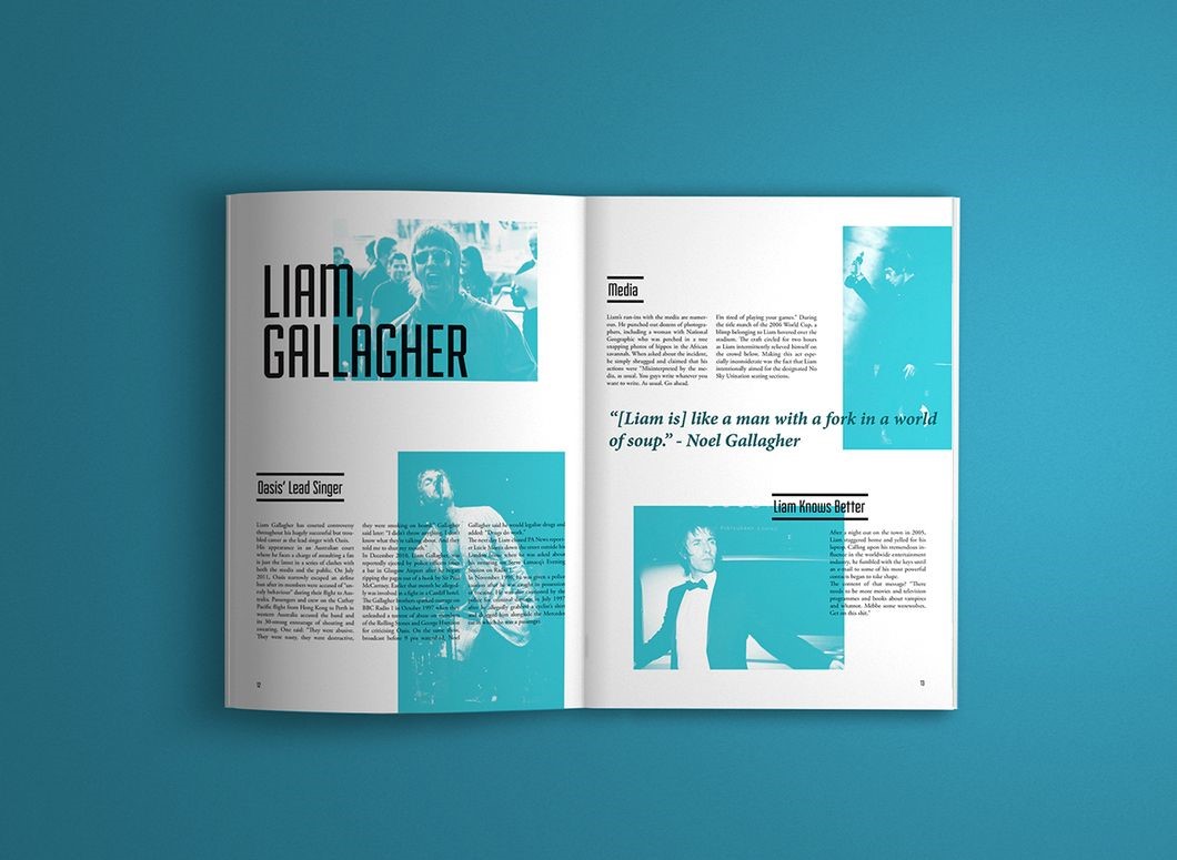
Source: David Salgado and Mariana Perfeito's editorial design
David Salgado and Mariana Perfeito's editorial design does both above, leaving plenty of white space between and around each layout section while grouping related items. The result is a clean and balanced design.
6. Typography: Choosing Fonts Strategically
When typesetting, there are other aspects to consider besides Typographic hierarchy. Different aspects of the fonts can make or break the design, such as the category used, decorative, script, sans-serif, serif or script or even the use of uppercase, lowercase, bold or italic, the width of the strokes, etc. Notice how typeface affects the hierarchy order of the words in the web design below for The Tea Factory. "The perfect teas to keep you warm" is the focal point. Still, differences in type weight, italicisation, and word placement produce a more dynamic, less linear reading experience. "See our selection," the call to action, is more strongly emphasised than the text above due to sizing and spacing.
7. Incorporating Style & Texture
Another way of drawing attention is to give content ample room to breathe. A crowded site will render your visitors lost and later ask themselves, "What am I supposed to do here?" Ultimately, they click away, absorbing no information about your brand. If substantial negative space is left around a button or the lines in a text block are widely tracked, these elements will be more readily visible to readers.
Source:Source: Posters "Bright Pink" via Smashing Magazine
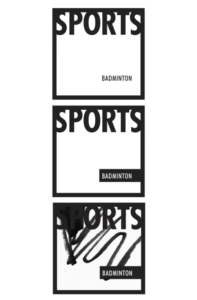
In the first image, the word "Sports" is higher in the hierarchy than "badminton" due to being higher, bigger and bolder. In the second image, the two terms are about equivalent. Thanks to a black rectangle that highlights "badminton" and sets it into its own space. In the third image, a background scribble interrupts the space of "Sports" but not "badminton." Consequently, this results in a reversal where "badminton" is the highest in the hierarchy. Such a progression is difficult to predict, so designers often chalk it to a holistic sense of "texture."
9. Harmonious Composition
Using some of the techniques in the article can help guide visitors to your website through your design and layout. Think of it as a first impression. At first glance, does your website leave a pleasant impression? Or will it scare visitors away because elements are all over the place? Overall, most designs will greatly benefit from putting in place an overall structure, more commonly known as the composition, which is made up of Implied Movement:
The Rule of Thirds – A Rule for Balanced Composition
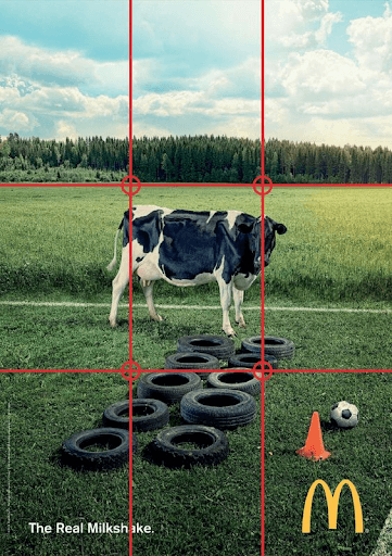
Following the rule of thirds is one way of creating a dynamic composition. This is where your focal point isn't predictably placed at the centre. Instead, this rule divides a layout into a grid (three equally spaced horizontal lines and three vertical lines). The focal point is placed either on one of the lines or, ideally, on one of the four points where the lines intersect.
The Rule of Odds

The Rule of Odds often involves threes as well. The idea is that an odd number of objects – perhaps the focal point surrounded by two or four –is always more interesting and pleasing to the eye than an even number.
"Good visual hierarchy isn't about wild and crazy graphics or the newest Photoshop filters; it's about organising information in a way that's usable, accessible, and logical to the everyday site visitor." – Failed Hierarchy, Brandon Jones (Web Designer Speaker, Author, Former editor for Tuts+)
Access our insightful infographic to gain valuable insights and practical tips for designing visually appealing web experiences.
Download our guide on how to design your company website with 15 best practices!
Conclusion
As suggested in the last section, it's important to note that hierarchy can be used for both good and evil. Think of all the annoying Flash advertisements, popup windows and glitter banners that the web has been plagued with for years! While these ads succeed in grabbing attention, they ultimately fail the site owner. They also fail the viewer by breaking the visual hierarchy within a site.
Similarly, if a designer builds a visual hierarchy with certain critical pieces of information that are nearly impossible to find, the designer will have failed at his task. Brandon Jones put it best when he states that good visual hierarchy isn't about wild and crazy graphics or the newest Photoshop filters; it's about organising information in a way that's usable, accessible, and logical to the everyday site visitor.
Originally published: 2 November 2017
Updated: 18 September 2023
Unlock the full potential of your online presence with an award-winning web design agency in Singapore services. From effective web design to seamless functionality, we craft digital experiences that captivate. Elevate your website's performance and realise your digital goal with us!

