Content
SHARE

Email marketing is essential for businesses looking to reach and engage with their target audience effectively. However, simply sending out emails is not enough. To make an impact, you must create email marketing designs that convert. In this article, we will explore the key elements of an effective email design and provide a step-by-step guide to creating designs that drive conversions.
Understanding the Basics of Email Marketing Design
Before diving into the specifics of creating designs that convert, it is crucial to understand the importance of a well-crafted email design. A visually appealing and strategically designed email can significantly impact the success of your email marketing campaigns. Email marketing is essential for businesses to connect with their audience and drive conversions. With millions of emails being sent daily, standing out from the crowd and making a lasting impression is crucial. This is where a well-designed email comes into play.
The Importance of a Well-Crafted Email Design
A well-designed email not only catches the recipient’s attention but also communicates your brand message effectively. It helps you establish credibility and builds trust with your audience. When your subscribers receive a beautifully designed email, they are more likely to engage with your content and take the desired action. Imagine receiving an email that is cluttered, poorly formatted, and lacking visual appeal. It would be challenging to read and understand the message, let alone take any action. On the other hand, a well-crafted email design creates a positive user experience, making it easier for your subscribers to navigate through the content and respond to your call to action.
Key Elements of an Effective Email Marketing Design
Several key elements contribute to the overall effectiveness of your email marketing design. These include:
- Clear and compelling subject lines
The subject line is the first thing your subscribers see when they receive your email. Crafting a subject line that grabs attention and entices them to open the email is crucial. A well-written subject line sets the tone for your email and increases the chances of engagement. - Engaging email layout and visuals
The layout and visuals of your email play a significant role in capturing your audience’s attention. A visually appealing design with a clear information hierarchy makes it easier for your subscribers to digest the content. Incorporating eye-catching visuals, such as images or videos, can further enhance the overall appeal of your email. - Persuasive email copy
The words you choose in your email copy can make or break your campaign. Persuasive and compelling copywriting techniques can help you effectively convey your message and encourage your subscribers to act. Understanding your audience’s pain points and addressing them in a way that resonates with them is essential.
Each element is vital in capturing your audience’s attention and encouraging action. By paying attention to these details and investing time in crafting a well-designed email, you can significantly improve the effectiveness of your email marketing campaigns.
Steps to Creating an Email Marketing Design That Converts
Now that we understand the importance of a well-crafted email design let’s delve into the steps to create designs that drive conversions. Email marketing has become essential for businesses to connect with their customers and drive sales. However, simply sending out generic emails is not enough. To truly make an impact and achieve high conversion rates, you need to create email designs that are visually appealing, engaging, and tailored to your target audience.
Identifying Your Target Audience
Before you start designing your emails, it is crucial to have a clear understanding of your target audience. This will help you tailor your design and messaging accordingly. Conduct thorough market research and create buyer personas to ensure your emails resonate with your intended audience. For example, if you’re a fashion retailer targeting young adults, your email design should reflect their tastes and preferences. Use vibrant colours, trendy fonts, and images that appeal to this demographic. On the other hand, if your target audience is corporate professionals, a more sleek and professional design would be more appropriate.
Crafting a Compelling Subject Line
The subject line is the first thing recipients see in their inbox. It needs to be attention-grabbing and compelling enough to make them open your email. Keep it concise but impactful, and consider using personalisation techniques to increase engagement. One effective strategy is to use the recipient’s name in the subject line. This personal touch can make the email feel more personalised and increase the chances of it being opened. Additionally, using action-oriented language or posing a question can pique the recipient’s curiosity and encourage them to click.
Designing an Engaging Email Layout
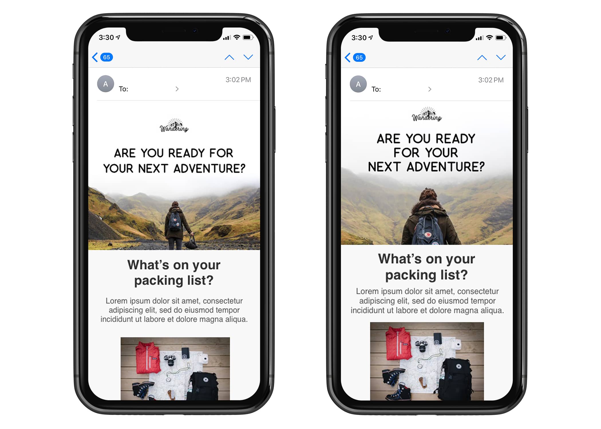
Your email layout plays a crucial role in guiding the recipient’s attention and conveying your message effectively. Use a clean and well-organised design with a clear hierarchy and visual cues that lead the reader through the content. Ensure the email is easy to scan and navigate, with a clear call-to-action. Consider using a responsive design that adapts to different screen sizes, as many people now access their emails on mobile devices. This will ensure that your email looks great and functions properly, regardless of the device on which it is viewed.
Writing Persuasive Email Copy
The content of your email is just as important as its design. Craft persuasive copy that communicates your message and compels the reader to take action. Use compelling language, focus on benefits, and highlight unique selling points to drive conversions. When writing your email copy, it’s essential to balance being informative and concise. Keep paragraphs short and use bullet points or numbered lists to break up the text and make it easier to read. Use persuasive language and include a clear call-to-action that tells the recipient what you want them to do next. Remember, the goal of your email is to encourage the recipient to take action, whether it’s making a purchase, signing up for a webinar, or downloading a free resource. Combining a visually appealing design with persuasive copy allows you to create email marketing campaigns that convert.
Optimising Your Email Design for Different Devices
In today’s mobile-dominated world, ensuring your email designs are mobile-friendly is crucial. With a significant portion of emails being opened on smartphones and tablets, it is essential to create responsive designs that adapt to different screen sizes and resolutions.
Ensuring Mobile-Friendly Designs
Create designs that are visually appealing and accessible on both desktop and mobile devices. Ensure that the fonts and buttons are large enough to be easily clickable on smaller screens, and optimise your images for faster loading times.
Testing Your Design on Various Platforms
Testing your email designs on different email clients and devices is essential to ensure a consistent experience across platforms. Pay attention to rendering issues and make necessary adjustments to optimise the design for different platforms.
Tracking and Improving Your Email Marketing Design
Creating effective email designs is an ongoing process that requires continuous monitoring and improvement. Tracking email marketing metrics and making data-driven adjustments can help you optimise your designs and drive better conversion rates.
Analysing Email Marketing Metrics
Keep a close eye on key metrics such as open, click-through, and conversion rates. Analyse this data to identify trends and areas for improvement. Use A/B testing to experiment with different design elements and measure their impact on your conversion rates.
Making Necessary Adjustments for Better Conversion
Based on your analysis, make necessary adjustments to your email designs. This could include tweaking the layout, refining your copy, or even revisiting your target audience segmentation. Continuously test and iterate to improve your designs and maximise conversions.
Keeping Up with Email Marketing Trends
Email marketing is constantly evolving, with new trends and best practices emerging. Stay up to date with industry news and email design trends to ensure your designs remain fresh and engaging. Experiment with new techniques and technologies to stay ahead of the curve.
In conclusion, creating email marketing designs that convert requires careful consideration of design elements, audience targeting, and continuous improvement. Following the steps outlined in this article and staying up to date with industry trends, you can create compelling email designs that drive conversions and help you achieve your marketing goals.
Frequently Asked Questions About How to Create Email Marketing Designs That Convert
What Are the Key Elements of Effective Email Marketing Design?
Key elements include a clean and organised layout, visually appealing graphics, easy-to-read fonts, a colour scheme that reflects your brand, and clear, compelling call-to-actions (CTAs) that guide users towards conversion.
How Can I Ensure My Email Design Is Mobile-Friendly?
To ensure mobile-friendliness, use responsive design templates, keep email content concise, use large, clickable buttons for CTAs, and test your emails on various devices and email clients before sending.
What Role Does Colour Play in Email Marketing Design?
Colour plays a crucial role in conveying your brand’s identity, evoking emotions, and influencing user actions. Choose colours that align with your brand and the message you want to communicate, and use contrast to make your CTAs stand out.
How Can I Create a Compelling Call-To-Action in My Email Design?
Create compelling CTAs by using action-oriented language, making them visually distinct within the email layout, and placing them strategically to guide readers naturally towards the desired action. Keep it simple and direct, focusing on one primary action you want the user to take.


