Content
SHARE
Crafting a website that captivates and engages your target audience is crucial for B2C businesses looking to thrive in the highly competitive online market. With the right web design, you can create a seamless user experience that drives conversion rates and builds brand loyalty. We will explore the core elements of an engaging B2C website design and provide essential tips and tricks to ensure your website stands out.
(Source: Web India )
Understanding the Importance of Web Design in B2C Businesses
When it comes to B2C businesses, the first impression is everything. A well-crafted website design can make or break a customer’s decision to explore further or move on to a competitor. The aesthetic appeal of your website plays a significant role in capturing the attention and interest of your target audience.
In addition to the visual appeal, your website’s functionality and user experience are crucial factors that contribute to the success of your B2C business. You must ensure that your website looks good and functions seamlessly as it’s a key to keeping visitors engaged and converting them into customers.
The Role of Aesthetics in Customer Engagement
An aesthetically pleasing website design creates a positive emotional response in users, evoking a sense of trust, professionalism, and credibility. It showcases your brand’s personality and creates a lasting impression. From the choice of colours, typography, and layout, each element should align with your brand identity and appeal to your target customers’ tastes.
Moreover, incorporating visually appealing graphics, high-quality images, and interactive elements can further enhance the overall aesthetic appeal of your website. These elements make your website more visually engaging and help convey your brand message effectively to your audience.
How Functionality Influences Consumer Behaviour
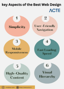
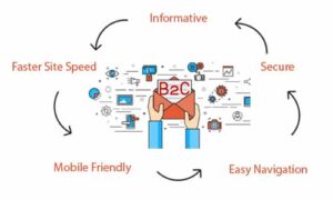
While aesthetics are important, functionality is equally critical to engage consumers. Your website should be easy to navigate, with a clear and intuitive interface that guides users to their desired destination. A well-organized site structure and intuitive navigation flow enhance user experience, making it effortless for visitors to find information, browse products, and complete transactions.
Furthermore, incorporating quick load times, mobile responsiveness, and secure payment gateways can significantly impact consumer behaviour. A seamless and efficient website keeps visitors on your site for longer and encourages them to return for future purchases, ultimately contributing to the growth of your B2C business.
( Source: Medium )
Key Elements of an Engaging B2C Website Design
Now that we understand the significance of web design in B2C businesses, let’s delve into the key elements that contribute to an engaging website.
Creating an engaging B2C website involves more than aesthetics; it requires a deep understanding of user behaviour and preferences. By incorporating elements that resonate with your target audience, you can create a seamless and enjoyable browsing experience that encourages visitors to explore further.
The Art of Subject Lines
The subject line is the first thing recipients see in their inbox. It should be short, attention-grabbing, and relevant to the content of the email. A compelling subject line increases the chances of the email being opened and read by the recipient.
When crafting your subject line, consider using personalisation techniques or posing a question to pique the recipient’s curiosity. Creating a sense of intrigue or offering a solution to a problem can entice the reader to open the email and discover more about what you offer.
The Power of Intuitive Navigation
The navigation of your website is like a roadmap for visitors. It should be user-friendly, allowing users to find what they search for. Use clear and descriptive labels for your menu items and organise your content logically. Include search functionality to enhance user ability to find specific products or information.
Moreover, implementing a breadcrumb trail can help users understand their current location within the website hierarchy, making it easier to backtrack or navigate to related pages. A well-structured navigation system improves user experience and boosts the site’s usability.
Importance of Mobile-friendly Design
In today’s mobile-dominated world, you must optimise your website design for mobile devices. Responsive design ensures that your site adapts seamlessly to different screen sizes, providing an optimal viewing experience for mobile users. Mobile-friendly websites not only improve user satisfaction but also contribute to better search engine rankings.
Furthermore, incorporating touch-friendly elements such as larger buttons and streamlined forms can enhance the mobile user experience. By prioritising mobile responsiveness, you can cater to the growing number of users accessing websites on smartphones and tablets, ultimately increasing engagement and conversion rates.
The Role of Compelling Visuals
Visuals play a crucial role in capturing the attention of your audience. High-quality images and videos can convey your brand’s message, evoke emotions, and enhance the user experience. Incorporate visually appealing graphics that resonate with your target audience, enticingly showcasing your products or services
Additionally, utilising white space effectively can help direct focus towards key elements on the page, reducing visual clutter and improving readability. Striking a balance between text and visuals can create a visually stimulating website that attracts visitors and keeps them engaged throughout their browsing journey.
Essential Tips for Creating an Engaging B2C Website
Incorporating the key elements mentioned above is vital, but here are some additional tips to make your B2C website design more engaging:
Balancing Design and Usability
While an aesthetically pleasing design is essential, it should never compromise usability. Ensure your website is easy to navigate, loads quickly, and provides a seamless browsing experience across different devices. Focus on creating a visually stunning design that is also user-friendly and intuitive.
When considering the balance between design and usability, it is crucial to remember that users should be able to find what they are looking for quickly and effortlessly. Implement clear navigation menus, concise headings, and strategic placement of call-to-action buttons to guide visitors through your website. A harmonious blend of captivating design elements and practical usability will enhance the user experience.
Incorporating Social Proof in Your Design
Social proof, such as customer reviews, testimonials, and ratings, can significantly influence purchasing decisions. Incorporate these elements into your design strategically to build trust and credibility. Displaying prominent customer feedback can instil confidence in potential buyers, encouraging them to purchase.
Furthermore, integrating social media feeds or showcasing real-time customer interactions can create a sense of community and authenticity around your brand. By leveraging social proof effectively, you not only enhance the visual appeal of your website but also establish a connection with your target audience based on trust and reliability.
Leveraging the Power of Colour Psychology
Choosing the right colours for your website can evoke specific emotions and influence user behaviour. Research colour psychology and select a colour palette that aligns with your brand identity and evokes the desired response. For example, blue exudes trust and reliability, while orange signifies enthusiasm and creativity.
Moreover, understanding cultural associations with different colours can help you tailor your website’s colour scheme to resonate with your target market. Incorporating colour psychology principles into your design strategy can create a visually appealing website that effectively attracts attention and communicates your brand values.
( Source: Web Alive )
Common Pitfalls to Avoid in B2C Web Design
While understanding what to include in your B2C website design is crucial, it is equally important to be aware of the common pitfalls to avoid:
Overcomplicating Your Design
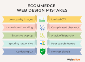
Although it may be tempting to showcase your creativity, cluttered and complex designs can overwhelm users. Keep your design clean, uncluttered, and focused on key messages and actions. Eliminate unnecessary elements that may distract users from their intended goal.
Neglecting Load Times and Performance
Slow loading times can frustrate users and lead them to abandon your website. Optimise your web pages for speed and performance by compressing images, minifying code, and leveraging caching techniques. Regularly monitor and optimise your site to ensure fast and seamless user experiences.
Ignoring the Importance of Consistency
A consistent design across your website creates a cohesive and professional look. You should maintain consistent branding elements in your site through logo placement, font styles, and colour schemes. Inconsistencies can make your website appear improper and lose users.
However, a few other pitfalls are worth mentioning in B2C web design. One such pitfall is inept mobile responsiveness. With the increasing use of smartphones and tablets, you must ensure your website is optimised for mobile devices. A responsive design allows your website to adapt to different screen sizes, providing a seamless user experience across all devices.
Another common pitfall is the shortage of clear and concise navigation. Users should easily find what they are looking for on your website. Implementing a well-structured navigation menu with clear labels and logical hierarchy can greatly enhance the user experience and prevent frustration.
Furthermore, neglecting the importance of accessibility can be a significant pitfall. It is essential to design your website with accessibility in mind, ensuring that it is usable for individuals with disabilities. Consider factors such as colour contrast, keyboard navigation, and alternative text for images to make your website inclusive for all users.
In conclusion, crafting an engaging web design for your B2C website involves considering aesthetics and functionality. By understanding the importance of web design, embracing key elements, implementing essential tips, and avoiding common pitfalls, you can create a compelling online presence that captivates your target audience, boosts conversion rates, and establishes your brand as a leader in the competitive B2C market.
Frequently Asked Questions About Crafting an Engaging Web Design for B2C Websites: Essential Tips and Tricks
What are the key elements of engaging B2C web design?
Key elements include a user-friendly layout, visually appealing graphics, intuitive navigation, fast loading times, and mobile responsiveness to ensure a seamless experience across all devices.
How can colour psychology be used in B2C web design?
Colour psychology can be effectively used in B2C web design to evoke specific emotions, convey brand identity, and influence consumer decisions. Choosing the right colour palette can enhance user engagement and drive conversions.
What role does typography play in B2C websites?
Typography plays a crucial role in enhancing readability, establishing information hierarchy, and creating a personality for the brand. Well-chosen fonts ensure that content is both attractive and easy to digest.
How can B2C websites optimise their design for conversions?
To optimise design for conversions, B2C websites should focus on clear and compelling call-to-action buttons, simplify the checkout process, use high-quality images, and ensure that key information is easy to find.

