
Content
SHARE

In today’s digital age, businesses must have a strong online presence. With an increasing number of people using their smartphones and tablets to browse the internet, your website must be optimised for mobile users. This article will explore the importance of mobile optimisation in 2025 and discuss key elements of mobile-friendly website design. We will also explore implementing mobile SEO strategies and share tips on testing and improving mobile website performance.
(Source: https://webnus.net/why-is-mobile-seo-so-important/)
Understanding the Importance of Mobile Optimisation in 2025
With the rise of mobile browsing, it has become more important than ever for businesses to ensure their websites are mobile-friendly. Let’s quickly overview the growing prominence of mobile browsing before diving into why mobile optimisation matters for your website.
The Rise of Mobile Browsing: A Brief Overview
In recent years, mobile devices have become our go-to internet access tools. Whether checking social media, browsing online stores or searching for information, our smartphones and tablets have become an extension of ourselves. The convenience and portability they offer have made mobile browsing skyrocket in popularity. Gone are the days when people only turned to their desktop computers to access websites. Mobile devices have surpassed traditional computers as the primary way people consume online content. As a result, businesses need to adapt and ensure their websites cater to this mobile-first mindset.
Why Mobile Optimisation Matters for Your Website
Now that we understand the growing relevance of mobile browsing let’s explore why mobile optimisation is crucial for your website’s success. Firstly, a mobile-friendly website enhances user experience. When visitors can easily navigate and find information on your website, they are likelier to stay, explore further, and ultimately convert into customers. On the other hand, a poorly optimised site with long load times and a confusing layout can turn users away, leading to high bounce rates and lost opportunities.
Secondly, mobile optimisation impacts your search engine rankings. In 2021, Google rolled out mobile-first indexing, primarily using the mobile version of a website for indexing and ranking. If your website is not optimised for mobile, it may be penalised in search engine results, causing your organic visibility to suffer. Lastly, mobile optimisation is essential for reaching local customers. With the rise of “near me” searches and location-based targeting, ensuring your website is mobile-friendly can help attract potential customers searching for products or services in your area.
(Source: https://uxplanet.org/principles-of-mobile-site-design-c4c721693c42?gi=847bdee7204b)
Key Elements of Mobile-Friendly Website Design
Now that we understand the importance of mobile optimisation let’s explore the key elements of mobile-friendly website design.
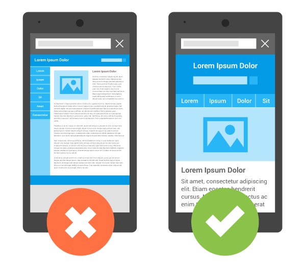
Responsive Design: Adapting to Different Screen Sizes
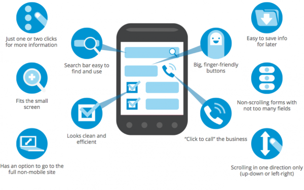
A responsive design ensures that your website adapts seamlessly to different screen sizes. Whether your visitors use smartphones, tablets, or even smartwatches, a responsive design allows your website to adjust its layout and content to provide an optimal viewing experience. By implementing a responsive design, you eliminate the need for users to zoom in or out and scroll horizontally, making your website more user-friendly and intuitive.
Speed Optimisation for Mobile Users
Mobile users tend to have less patience for slow-loading websites than desktop users. Therefore, optimising your website for speed on mobile devices is vital. Compressing images, minifying code, and reducing server response time are just a few techniques that can significantly improve your website’s loading time. Faster load times enhance user experience and play a role in your website’s search engine rankings. Search engines, including Google, consider page speed a ranking factor, so make sure your website performs well in this aspect.
User-Friendly Navigation on Mobile Devices
Clear and intuitive navigation is paramount for mobile users who are often on-the-go and looking for quick access to the information they need. Simplify your website’s navigation menu, use clear labels and icons, and make sure it’s easy for users to find what they’re looking for with just a few taps or swipes. Additionally, consider implementing sticky headers or breadcrumbs to help users keep track of their location within your website, making navigating back and forth easier.
Implementing Mobile SEO Strategies
Mobile optimisation goes hand in hand with SEO (Search Engine Optimisation) strategies, specifically tailored for mobile users. Let’s explore some essential mobile SEO techniques you can implement for better visibility in mobile search results.
Mobile-First Indexing and Its Implications
As mentioned earlier, Google has shifted to mobile-first indexing. This means that Google’s algorithms primarily use the mobile version of your website to determine its position in search engine results. Ensuring your mobile website provides valuable and relevant content is crucial for ranking well. Pay attention to factors such as mobile page load speeds, structured data, and the accessibility of your mobile site to improve your chances of ranking higher.
Optimising Content for Mobile Search
When it comes to mobile optimisation, the content on your website plays a significant role. Make sure your texts are concise, easy to read, and formatted correctly for mobile devices. Break up long paragraphs into smaller chunks, use headings and subheadings, and utilise bullet points and lists to make your content scannable. Additionally, consider using mobile-friendly formats such as videos and infographics to enhance the user experience.
Local SEO for Mobile Users
Local SEO strategies are essential to maximise your website’s visibility for local mobile searches. Start by creating and optimising your Google My Business profile, ensuring that your business’s name, address, and phone number (NAP) are consistent across all online platforms. Encourage customers to leave reviews, engage with local directories and listings, and consider developing location-specific landing pages to target potential customers in specific areas.

(Source: https://medium.com/nerd-for-tech/mobile-app-vs-website-performance-testing-differences-d9d172d36a6c)
Testing and Improving Mobile Website Performance
Testing and continuously improving your mobile website performance should be an ongoing process. Let’s explore some tools and practices that can help you assess and improve the performance of your website on mobile devices.
Tools for Testing Mobile Website Speed and Usability
Several tools help you evaluate your website’s speed and usability on mobile devices. Google’s PageSpeed Insights and Lighthouse are great starting points for assessing your website’s performance and identifying areas for improvement. Consider running tests regularly to ensure your website remains optimised as you make updates and changes.
Interpreting and Acting on Performance Data
Collecting and analysing performance data from tools like Google Analytics can provide valuable insights into how users interact with your mobile website. Monitor metrics such as bounce rate, average session duration, and conversion rate to identify areas that require attention. Use this data to make informed decisions and implement changes that improve user experience and drive better results.
Regular Updates and Maintenance for Mobile Optimisation
Finally, remember that mobile optimisation is an ongoing effort. As technology evolves and user behaviours change, staying updated and adapting your website is essential. Regularly review your website’s performance, conduct user testing, and make necessary updates to ensure your website continues to provide a seamless mobile experience.
Conclusion
As we look ahead to 2025, mobile optimisation remains a top priority for businesses seeking online success. You can ensure your website stays ahead of the curve by understanding the importance of mobile optimisation, implementing key elements of mobile-friendly website design, and utilising mobile SEO strategies. Regularly test and improve your mobile website performance, using the right tools and data to drive continuous enhancements. Investing time and effort into optimising your website for mobile users can provide an exceptional user experience and maximise your chances of attracting and retaining valuable customers in future years.
Frequently Asked Questions About How to Optimise Your Website for Mobile Users
Why Is Mobile Optimisation Crucial For Websites In 2025?
Mobile optimisation is crucial due to the increasing prevalence of mobile internet users, affecting website traffic, search engine rankings, user experience, and conversion rates.
What Are The Key Elements Of Optimising A Website For Mobile Users?
Key elements include responsive design, fast loading times, easy navigation, optimised images and content for small screens, and touch-friendly interfaces.
How Can Website Speed Be Improved For Mobile Users?
Website speed can be improved by optimising images, leveraging browser caching, minimising redirects, using a Content Delivery Network (CDN), and reducing server response time.
What Role Does Responsive Design Play In Mobile Optimisation?
Responsive design plays a crucial role by ensuring that a website automatically adjusts its layout, content, and navigation for optimal viewing and interaction across various devices and screen sizes.


